Taking control of animations in R and demystifying them in the process
May 2, 2017
A while ago (a very long time ago some would say) I showed how I had created my logo using R. In that post I left on the bombshell that I would return and show you how it is possible to add some fancy animation to it. The time to do that is now!
During this post I will go in depth with how it is possible to make very fancy and custom animations in R. I’ll not be using either my own tweenr package or the excellent gganimate package by David Robinson as we want some more fine tuned control over the final look. Instead we’ll be making parameterized functions that modify the D and i based on a time point. Hopefully, by the end of this post I’ll have demystified the art of animations even more than I did in my last animation post.
We’ll continue unabated from the code used to make the logo in the first place,
meaning that we have three ggplot objects at our disposal: D, i_stem, and
i_dot. We’ll focus on the animation of each in turn and then assemble it in
the end.
Animating a D
My idea for the D is to draw each line in a random order. In order to make sure that it appears as if the lines are drawn rather than gradually appearing (an important distinction) we need to make sure that the tip of the line is always at maximum opacity. I want each line to take one second to draw and the full animation to last for 6 seconds, making the first 5/6 of the animation time the allowed slot for initiating a line drawing.
The first thing to do is to partially build the plot. If you have not tinkered with ggplot2 you might not know that a ggplot object is converted to the plot you see in a two-pass manner. The first pass takes care of training scales, scaling variables, splitting data out in facets, performing statistical transformations etc. The last pass uses all this information to actually do the drawing. This can be used to our advantage (in the same way that gganimate uses it) by intercepting the plot creation after the first pass and tinker with the data. Here, our main operation will be to filter the data appropriately and apply a transformation of the alpha values.
# Perform the first part of the plot creation
D_b <- ggplot_build(D)

# Our prepared plot data now resides in the data slot
D_b$data[[1]][1:6, 1:6]
#> edge_colour edge_alpha x y group index
#> 1 #EFC94C 0.1000000 0.000000 1.000000 1 0.00000000
#> 2 #EFC94C 0.1090909 1.319865 1.026755 1 0.01010101
#> 3 #EFC94C 0.1181818 2.612795 1.106293 1 0.02020202
#> 4 #EFC94C 0.1272727 3.878788 1.237527 1 0.03030303
#> 5 #EFC94C 0.1363636 5.117845 1.419368 1 0.04040404
#> 6 #EFC94C 0.1454545 6.329966 1.650727 1 0.05050505# Randomize the order of edge drawings
edge_order <- sample(unique(D_b$data[[1]]$group))
# Define the proportion of time it takes to draw an edge
edge_draw_time <- 1/6
# Get time difference between starting a new edge
edge_stagger <- (1 - edge_draw_time) / (length(edge_order) - 1)We subtract one from the number of edges in the last step because we want to start the drawing at time 0. Let’s write a function that takes a time point between 0 and 1 and only draws the edges that have appeared then:
D_anim <- function(plot, t, edge_order, edge_stagger) {
    has_appeared <- (seq_along(edge_order) - 1) * edge_stagger <= t
    include_groups <- edge_order[has_appeared]
    plot$data[[1]] <- plot$data[[1]][plot$data[[1]]$group %in% include_groups, ]
    ggplot_gtable(plot)
}

# A quick test
grid.newpage()
grid.draw(D_anim(D_b, 0.1, edge_order, edge_stagger))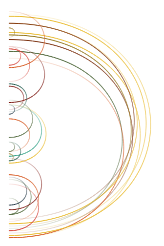
We’re not done yet though as we still need to gradually draw the arcs rather
than have them appear out of the blue. We’ll modify the D_anim() function to
achieve this.
D_anim <- function(plot, t, edge_order, edge_stagger, edge_draw_time) {
    # Decide the part of the data to draw
    has_appeared <- (seq_along(edge_order) - 1) * edge_stagger <= t
    include_groups <- edge_order[has_appeared]
    data <- plot$data[[1]]
    data <- data[data$group %in% include_groups, ]
    start_time <- (match(data$group, edge_order) - 1) * edge_stagger
    draw_time <- start_time + data$index * edge_draw_time
    data <- data[draw_time <= t, ]
    # Modify the alpha value to always be 1 at the end of the tip
    max_alpha <- lapply(split(data$edge_alpha, data$group), max)
    group_index <- match(as.character(data$group), names(max_alpha))
    alpha_left <- 1 - unlist(max_alpha)
    data$edge_alpha <- data$edge_alpha + alpha_left[group_index]
    # Assign modified data back
    plot$data[[1]] <- data
    # Complete the creation of the plot
    ggplot_gtable(plot)
}

# A quick test
grid.newpage()
grid.draw(D_anim(D_b, 0.3, edge_order, edge_stagger, edge_draw_time))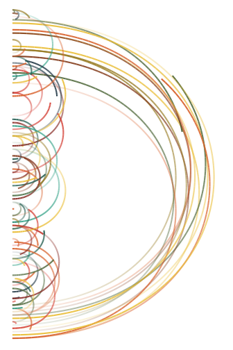
This actually looks like what we were aiming at. The only way to find out is to
create a lot of plots along t and assemble them into an animation
# We'll set a frame rate of 15 fps
nframes <- 6 * 15

for (f in seq_len(nframes) - 1) {
    t <- f / (nframes - 1)
    grid.newpage()
    grid.draw(D_anim(D_b, t, edge_order, edge_stagger, edge_draw_time))
}
In order to create the gif yourself (it is handled automatically by knitr) you
can wrap the above in animation::saveGIF().
Animating the i
The i animation will be broken up in two separate animations - one for the dot and one for the stem. We’ll start with the dot since this continues nicely from the approach used with the D
Animating the dot of the i
As with the D the plan is to draw the edges progressively but this time we
won’t do it in a random fashion but instead circle around the perifery, starting
the drawing of all edges from a single node at a time. There are two layers in
this plot, both the edges and the leaf nodes, so we need to modify two data
layers as well. Another consideration is that we do not get the order of the
nodes for free - we only know their x and y coordinates and it is up to us to
translate this into a order around the circle. There are many ways to do this,
but just for the sake of self-promotion I’m going to use radial_trans() from
ggforce to translate the coordinates back to radians.
i_dot_b <- ggplot_build(i_dot)
r_trans <- radial_trans(c(0,1), c(0,1), pad = 0)
node_order_i <- rank(r_trans$inverse(i_dot_b$data[[2]]$x, i_dot_b$data[[2]]$y)$a)
edge_order_i <- i_dot_b$data[[1]][i_dot_b$data[[1]]$index == 0, ]
edge_order_i <- match(
    interaction(round(edge_order_i$x, 6), round(edge_order_i$y, 6)),
    interaction(round(i_dot_b$data[[2]]$x, 6), round(i_dot_b$data[[2]]$y, 6))
)
edge_order_i <- node_order_i[edge_order_i]
node_stagger_i <- (1 - edge_draw_time) / (length(node_order_i) - 1)
Now we got the information we need. We first decided the order in which to draw the nodes. Then we matched the start position of the edges to the position of the nodes (taking care of floating point problems) and used the node order to decide the edge order.
i_dot_anim <- function(plot, t, node_order, edge_order, node_stagger, edge_draw_time) {
    node_data <- plot$data[[2]]
    edge_data <- plot$data[[1]]
    full_colour <- edge_data$edge_colour[edge_data$group == 1]

    node_data <- node_data[(node_order - 1) * node_stagger <= t, ]
    include_edges <- which((edge_order - 1) * node_stagger <= t)
    edge_data <- edge_data[edge_data$group %in% include_edges, ]
    start_time <- (edge_order[edge_data$group] - 1) * node_stagger
    draw_time <- start_time + edge_data$index^2 * edge_draw_time
    edge_data <- edge_data[draw_time <= t, ]

    n_seg <- lengths(split(edge_data$group, edge_data$group))
    edge_data$edge_colour <- unlist(lapply(n_seg, tail, x = full_colour))

    plot$data[[1]] <- edge_data
    plot$data[[2]] <- node_data

    ggplot_gtable(plot)
}

# A quick test
grid.newpage()
grid.draw(i_dot_anim(i_dot_b, 0.3, node_order_i, edge_order_i, node_stagger_i, edge_draw_time))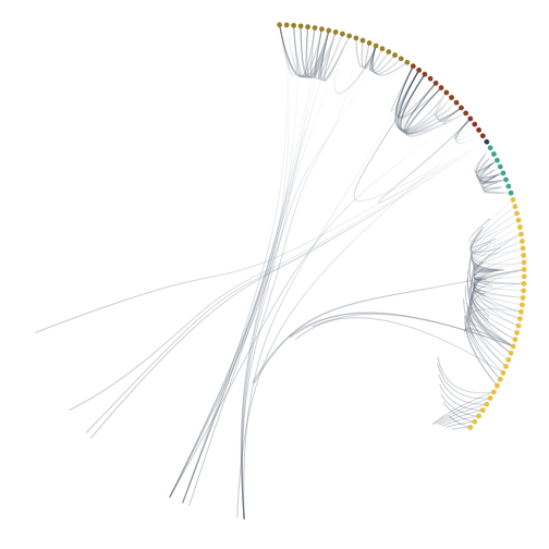
There are some slight variations from how we did it with the D but a lot of code is almost identical. One main difference is that we are not modifying the alpha level this time but rather the colour gradient as the alpha level is fixed at 0.25 to combat overplotting. Another difference is that I square the index value as a cheap easing function making the edges shoot away from the node and gradually loose momentum.
Once again we’ll make a quick test:
for (f in seq_len(nframes) - 1) {
    t <- f / (nframes - 1)
    grid.newpage()
    grid.draw(i_dot_anim(i_dot_b, t, node_order_i, edge_order_i, node_stagger_i, edge_draw_time))
}
Animating the stem of the i
For the last part of the logo we’ll once again apply a bit of randomness and let the rectangles growth forth in a random fashion. This is seemingly simple, but there’s a catch. The plot actually consists of two layers, one of them only containing the leafs (which draws the filled rectangles) and one containing all nodes (drawing the borders). In order for the animation to appear natural these two layers needs to be orchestrated.
# We'll start by generating the plot data
i_stem_b <- ggplot_build(i_stem)

# We'll assign a random drawing order to the nodes
fill_order <- sample(nrow(i_stem_b$data[[1]]))

# let us then find the offspring of each border box
offsprings <- lapply(seq_len(nrow(i_stem_b$data[[2]])), function(i) {
    encloses <- which(
        i_stem_b$data[[2]]$x > i_stem_b$data[[2]]$xmin[i] &
            i_stem_b$data[[2]]$x < i_stem_b$data[[2]]$xmax[i] &
            i_stem_b$data[[2]]$y > i_stem_b$data[[2]]$ymin[i] &
            i_stem_b$data[[2]]$y < i_stem_b$data[[2]]$ymax[i]
    )
    setdiff(encloses, i)
})

# and match the leaf borders to the index of the filled leafs
stroke_order <-fill_order[match(
    paste(i_stem_b$data[[2]]$xmin,
          i_stem_b$data[[2]]$xmax,
          i_stem_b$data[[2]]$ymin,
          i_stem_b$data[[2]]$ymax),
    paste(i_stem_b$data[[1]]$xmin,
          i_stem_b$data[[1]]$xmax,
          i_stem_b$data[[1]]$ymin,
          i_stem_b$data[[1]]$ymax)
)]

# For the parents we'll take the latest child
stroke_order <- sapply(seq_along(stroke_order), function(i) {
    if (is.na(stroke_order[i])) {
        max(stroke_order[offsprings[[i]]], na.rm = TRUE)
    } else {
        stroke_order[i]
    }
})
Now that we have defined the appearance order of all elements it’s time to decide how they shoould actually appear. In order for the borders to change smoothly the border width should increase from zero, while the fill can fade in by changing the opacity
node_draw_time <- edge_draw_time
node_stagger_stem <- (1 - node_draw_time) / (length(fill_order) - 1)

i_stem_anim <- function(plot, t, fill_order, stroke_order, node_stagger, node_draw_time) {
    # Get the progression of the appearance at the time point
    fill_progress <- (t - (fill_order - 1) * node_stagger) / node_draw_time
    fill_progress <- ifelse(fill_progress < 0, 0, ifelse(fill_progress > 1, 1, fill_progress))
    stroke_progress <- (t - (stroke_order - 1) * node_stagger) / node_draw_time
    stroke_progress <- ifelse(stroke_progress < 0, 0, ifelse(stroke_progress > 1, 1, stroke_progress))

    # Modify alpha and stroke size according to the progress
    plot$data[[1]]$alpha <- plot$data[[1]]$alpha * fill_progress
    plot$data[[2]]$size <- plot$data[[2]]$size * stroke_progress

    ggplot_gtable(plot)
}
# Test whether it makes sense
grid.newpage()
grid.draw(i_stem_anim(i_stem_b, 0.3, fill_order, stroke_order, node_stagger_stem, node_draw_time))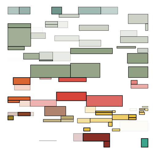
This looks like it should (I think). There’re no strokes without a fill appearing, and everything looks nice and random.
Putting it all together
As we have now succeeded in parameterizing the animation of each part of the plot it’s fairly easy to assemble it using the same code as was used to assemble the static version of the logo:
composite <- gtable(widths = unit(c(1.4, 0.15, 0.6, 0.15), 'null'),
                    heights = unit(c(0.15, 0.6, 0.15, 1.4), 'null'),
                    respect = TRUE)
for (f in seq_len(nframes) - 1) {
    tmp_comp <- composite
    t <- f / (nframes - 1)
    d_table <- D_anim(D_b, t, edge_order, edge_stagger, edge_draw_time)
    i_dot_table <- i_dot_anim(i_dot_b, t, node_order_i, edge_order_i, node_stagger_i, edge_draw_time)
    i_stem_table <- i_stem_anim(i_stem_b, t, fill_order, stroke_order, node_stagger_stem, node_draw_time)
    tmp_comp <- gtable_add_grob(tmp_comp, d_table, 1, 1, 4, 2)
    tmp_comp <- gtable_add_grob(tmp_comp, i_dot_table, 1, 2, 3, 4)
    tmp_comp <- gtable_add_grob(tmp_comp, i_stem_table, 4, 3)
    grid.newpage()
    grid.draw(tmp_comp)
}
There you have it: A fairly complex animation of a logo, made entirely in R!